3.04.2020
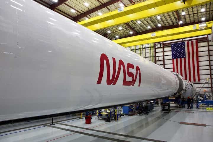
A famous NASA insignia that once adorned spacecraft, suits, and official documents will align its comeback with the first flight of astronauts from U.S. soil on a SpaceX Falcon 9 rocket.
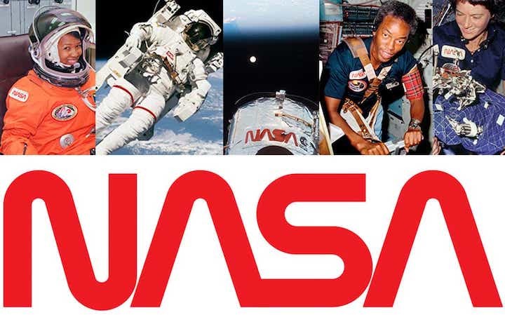
Widely recognized as a cutting-edge symbol for nearly two decades, NASA's red "worm" logo was used during an era when applying complicated insignia to products – like NASA's current "meatball" logo – was difficult to do and hard to distinguish. The agency began using the "worm" in 1975 after outsourcing its design to Danne & Blackburn, which helped develop a series of design-related proposals.
Though it was abandoned in 1992, the red logotype is back thanks to SpaceX's Falcon 9 rocket, which this year will host the first set of astronauts to launch from U.S. soil since the end of the space shuttle program in 2011. The flight is slated for mid-to-late May, though its timing may change due to the coronavirus pandemic.
"The retro, modern design of the agency’s logo will help capture the excitement of a new, modern era of human spaceflight," NASA said in a release Thursday.
But the logotype, which even received recognition from President Ronald Reagan in the form of a 1984 design award, has a complicated history.

The insignia was a radical departure from the more traditional "meatball," which led to some less-than-stellar opinions about its placement across agency products. The way it was announced to center directors – by not telling them, but quietly including it on new stationery shipments – led to design-related frictions within NASA. Many were taken by surprise.
"The managers at the NASA centers were upset over the unexpected announcement, and the employees were even more inflamed," a 2015 book published by NASA, titled "Emblems of Exploration," reads. "The perception of the program advocates was that the younger NASA employees preferred the new graphics program, but the older employees were, in general, upset over the change."
"There appeared to be no middle ground for the situation; employees and NASA’s partners either enthusiastically endorsed the logotype or despised it," historians Joseph Chambers and Mark Chambers said in the book.
By 1992, after adorning the space shuttle, buildings, space suits, documents, and even the Hubble Space Telescope, the "worm" was scrubbed. With the exception of souvenirs and historical documents, the "meatball" had become the dominant symbol for NASA.
With the upcoming revival, NASA says the red logotype will eventually be applied more places, though no official decisions have been made. The agency, though, will likely tread carefully this time around – after all, the "meatball" is still head honcho.

